

Brand and identity · Manchester
Be seen for who you are.
Twelve years turning what a business or a person really is into something they can be recognised by.
Currently building June
Ferryhill, County Durham
I want as few people as possible to feel as alone as I did.
I grew up in a pit village that had already decided what a person was supposed to be. I wrote that line down in 2020 and it has not changed since. Everything here is a version of it.
Douthwaite
Founder · 2026
June
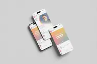
She was diagnosed on Christmas Eve 2025 and died on 17 February 2026. Somebody handed us a template for the Order of Service. Clip art, a cluttered border, a font nobody chose. So I sat up that night and made her a proper one.
I designed it, wrote it and built it. The builder, the print pipeline, the funeral director dashboard, all of it.
Eight feedback forms came back from those workshops. Not one of them praised my taste.
All eight said the same thing in different words. They could ask questions, nobody used jargon at them, and they did not feel stupid.
Hello
Are you looking for someone like me?
I am open to the right role, and I answer everything. A project, a question about June, or something I have written all count.
About
Everything I have built has been about the same thing.
Ferryhill, County Durham. Coal in the ground, soot in the air, fractures in the families. A village that had already decided what a person was supposed to be before I got there.
I was gay and I was a big kid, so I spent the first seventeen years of my life keeping every person I knew at a distance. I believed I was a broken thing. That belief did not survive. What it left behind did, which is a permanent interest in people who do not fit the shape they are being asked to fit.
Keeping that distance taught me to watch closely instead, to learn a world before I trusted it. That habit never left. I still immerse myself in a world before I try to build its identity, which is why the brand work has always been less about taste and more about understanding how a world actually sees itself.
I started Studio Potts at twenty-one because I was not willing to let anybody else decide how far my work could go. What followed kept enlarging the same idea. Identity for people being mistaken for their competitors. Then SheHeThey, so founders the mainstream skipped could sell without flattening themselves first. Then three years teaching a hundred founders, which taught me most people are not missing taste, they are missing permission.
Then in December 2025 my Nana June was diagnosed, and by February she was gone, and the way we were asked to say goodbye was not worthy of her.
Work
Work
Archive
Trained Eye Consulting, Czech Republic, 2019. Impress Property Services, County Durham, 2017. Spartan Computer Solutions, 2019. MFC Foundation, Middlesbrough, 2021.
June · 2026
Giving a family something worthy of the person they lost.
Douthwaite
Context
The Order of Service is the only object every single person at a funeral is handed. It goes into a coat pocket, a drawer, a memory box. People find them again years later. Almost nobody designs it as though that is true.
Challenge
The people who need this most are the least able to do it. A family three days into the worst week of their life cannot learn software, and a funeral director cannot absorb design work on top of everything else.
Approach
No blank canvas anywhere. The family answers plain questions about the person, and June builds the booklet in front of them. The funeral director approves before it prints.
A funeral director told me a design named after its cause would read, to a grieving family, as a label for how their person died. She was right.I took the causes off the selection screen entirely. She was never going to buy anything from me. That is not what feedback is for.
Identity before aesthetics.
Clarity before visibility.
WeDiscover · 2020
Building an identity from nothing.

Naming
Byron had led search engine marketing at Deliveroo, part of the team that built it into one of the biggest brands in the world. He left to do paid search properly for everyone else.
Paid search has one job: help people discover something they need. The name says exactly what the service does, nothing more abstract than that.
Identity system
The problem was never differentiation. It was legitimacy. In a credibility-driven market, a trend-led identity would have made them look like another consultancy with opinions, not one with conviction.
The gap in the o is the missing piece, the thing a client hasn't found yet in their own marketing. It runs through every touchpoint, standing for the same idea each time: exceeding limitations, together.


Expression
Red, blue, white. Leadership, immediacy, stability, expertise, empowerment, the things a paid-search consultancy has to prove before anyone hires them.
Three colours doing a specific job each, not six doing a vague one. The same discipline applied to the type and the spacing: nothing on the page that isn't earning its place.
Outcome
WeDiscover is now a team of nearly fifty. A multi-award-winning, seven-figure business.
Not because the identity was clever. Because it was legitimate from the first day, and it's still holding as the company grows into it.

“Each milestone deadline was hit, and the quality of the work has been superb.”Byron Tassoni-Resch, Founder and Managing Director “...and generally, Luke is a great guy who has a real interest and passion for your business.”
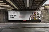
SheHeThey · 2021 to 2024 · Co-founder
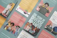
Designing a home for diverse brands.

Naming
Plenty of marketplaces talk about diversity. Few are built to structurally support it, serving many founders and audiences at once without collapsing into visual noise.
The name says the job plainly. She, he, they, every pronoun welcome before a single product loads.
Wordmarks
Multiple expressions of the core identity to work across contexts: primary wordmark for primary use, stacked variant for vertical layouts, logo lockup for icon spaces.


Sub-identities
A coherent system that could bend across different initiatives and contexts without losing coherence. Every secondary brand still felt like itself, but lived visibly within the SheHeThey universe.
Icon system
A set of icons designed to represent diverse brand categories. Each icon had to feel welcoming without dictating aesthetic, holding space for makers and businesses across every background.

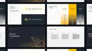
Brand guidelines
Comprehensive documentation ensuring every interaction, every collateral, every detail reinforced the promise. The guidelines became the constitutional document for all brand expression.
Extended guidelines


Digital experience
The platform itself had to be as intentional as the visual identity. Every interaction, every page, every detail reinforced the promise: this is a place where your brand can be fully itself, alongside others equally different.
The website became the longest-running, most-viewed expression of the system — tested daily by hundreds of brands and thousands of customers.

Platform variations

Real-world implementation


Social & marketing
The brand had to work at every scale, from a single social post reaching a potential customer to the full website welcoming a new seller. Consistency met flexibility in every asset created.
Strategic documents & collateral


”A marketplace that isn't focused just on sales. They focus on people rather than profit.”Katy, Manchester · customer
EnterprisingYou · 2021 to 2023
Teaching branding to people who were frightened of it.
Context
I arrived as the programme's first ever client, then ended up teaching on it. The founders coming through were sole traders, most of whom believed branding was something other people were allowed to have.
Challenge
The subject is enormous and the vocabulary is hostile. Anybody can make a non-expert feel stupid in an hour.
Approach
Dividing something overwhelming into pieces a person could carry, and ending every section with something written down rather than something understood.
“Such expert knowledge, yet managed not to overwhelm me with jargon.”Jennifer Bottrill, The Cultivated Classroom
“I know nothing about websites, but after this course I feel I have a much better understanding.”
Georgina Goodburn, GMG Driver TrainingStone Cold AF Brewery · 2020
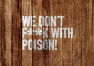
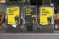
We don't f**k with poison.

Identity system
Five products under one attitude, and none of them apologise for being alcohol-free. Black and yellow first, the colours of a hazard sign, because looking gentle was never going to sell a drink built on defiance.
Every surface carries the same confidence, loud where it needs to be, unbothered by whether it offends. It doesn't read like a compromise. It reads like the real thing, minus the alcohol.


Logo system
The full lockup carries the tagline wherever there's room for it, a tighter secondary wordmark takes over wherever there isn't, and the seal, an asterisk standing in for the letters everyone already knows, travels alone wherever space is tightest of all.
Typography
Avenir Next Heavy carries the headlines and the seal, loud in the same weight every time. Baskerville, an old, serious serif, undercuts it wherever the copy needs to sound less like a dare. DIN Condensed Bold handles the small print and stats in between.
Colour palette
Black and yellow first, the colours of a hazard sign. Four accent colours, one per flavour beyond the original, split the range apart without ever softening the warning.
Packaging
Five colours, one format, easy to pick apart from across a fridge. Bottled or canned, the same hard-edged system carries through, seal dead centre every time.


Even the cap keeps the joke going. Twist it, flick it, and the small print underneath still reads "Drink f****g responsibly."

Expression
"Drink f*****g responsibly" instead of the standard small-print warning. The swearing isn't decoration, it's the whole attitude of the brand compressed into three words, and it survives everywhere from the can to the business card.


Drinking is a social expectation. Alcohol-free products are usually built as extensions of alcoholic ones, which quietly tells the person buying them that they are drinking a compromise.
This one had to be the opposite of an apology.
Armour rather than a substitute, so nobody has to feel demoralised by a room questioning their choice.
Big Yellow Sun
Big Yellow Sun · 2025
Not to lead.
Not to explain.
To hold space.

Identity system
The mark is a sun rendered as a fingerprint, organic lines that never quite close. Thought in motion, not a fixed symbol standing still.
Set on deep navy rather than white, so the gold has somewhere to glow instead of just sitting flat on the page.
Translating strategy into presence.
Jonathan's work spans leadership teams, founders and organisations navigating complexity. Twenty years advising brands from British Airways to Audi to Tesco, most of it spent making other people's substance visible rather than his own.
The challenge was expression without simplification. Depth without becoming academic, warmth without becoming soft, confidence without turning insight into spectacle. The real risk was over-design, because anything trying to impress would have undermined the work it was meant to support.
Expression
A restrained serif wordmark, a single accent colour, and enough negative space that the identity never has to raise its voice to be noticed.

“He listened, was always constructive, and produced great results.”Jonathan Staines, Big Yellow Sun “Luke was a patient and persistent help to me in creating my brand and website... thank you, Luke.”
August 2026
Now
June is live and early.
The product works. Families and funeral directors can build an Order of Service, and it prints. I have had my first real conversations with funeral homes, including a firm that told me no and then gave me the most useful hour of feedback I have had all year.
What I know now that I did not know in March: turnaround matters more than price, the market is funeral homes without an in-house design team, and a cause word next to a design name reads as a label for how somebody died. All three came from people telling me I was wrong.
Unnamed:
The Power of Your Name
A book about what happens when the name you were given, or the brand you built, stops fitting who you have become. It moves between memoir, psychology and business case studies, tracing naming as both a personal reckoning and a professional discipline. One chapter is published. The rest is in progress.
The Wrong Name: What Founders Can Learn from Naming Their Own Identity. October 2025.
Curriculum vitae
Luke Jordan Potts
Brand and identity strategist. Manchester, UK. He, they, she.
hello@lukejordanpotts.com
Education
First-Class BA (Hons) Design, New College Durham with The Open University, 2016 to 2019. D*D*D* Level 3 Extended Diploma, 2014 to 2016.
Achievements
Student of the Year, and winner of the ESA International Student Competition. Founding member of the Big Queer Business Meetup in Manchester, since taken on by OutBritain.
References
Available on request. Twelve are public on LinkedIn.
I am open to the right role.
I am strongest where strategic thinking has to turn into something people can see and use, brand strategy, identity systems, product design, then explained plainly enough for people who are not designers to get behind it.
The obvious question is whether I would leave the moment June takes off. Fair question. June is a small, self-funded product I built after my Nana died, and I intend to keep building it in the evenings, the way I have built it so far. I am not looking for somewhere to park while I raise money. I am looking for a team worth showing up for.
Contact
Say hello.
A role, a project, a question about June, or something I have written. All of it is welcome, and I answer everything.
Manchester, UK · He, they, she